
Nordstrom Rack Introduces Reimagined Brand Identity by Celebrating the Confidence and Savviness of its Customer
Nordstrom Rack unveiled a reimagined brand identity inspired by its bold, confident and savvy customer base. The identity developed in partnership with global branding agency Jones Knowles Ritchie (JKR), aims to further differentiate Nordstrom Rack in a competitive and loud off-price retail market, attract new customers and better connect with existing customers.
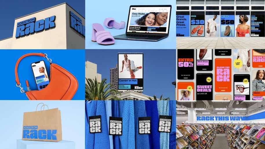
“The refreshed Nordstrom Rack brand identity reflects the authentic, empowered and expressive spirit of our customers and communicates the ‘more-ness’ of the Rack -- more fashion, more of their favorite brands, more deals, more access in store and online,” said Red Godfrey, vice president of creative at Nordstrom, Inc. “Through this new comprehensive and cohesive brand identity system, we aim to evolve our brand expression so we can effectively communicate our brand proposition, great brands at great prices, and invite customers to Rack their way.”
Nordstrom Rack offers a differentiated product assortment from some of Nordstrom’s top brands. Today, 90% of the top brands at Nordstrom are sold at Nordstrom Rack.
This entire brand system, including the logo, was built flexibly and responsively for a digital era, delivering a consistent brand experience wherever a customer interacts with the brand.
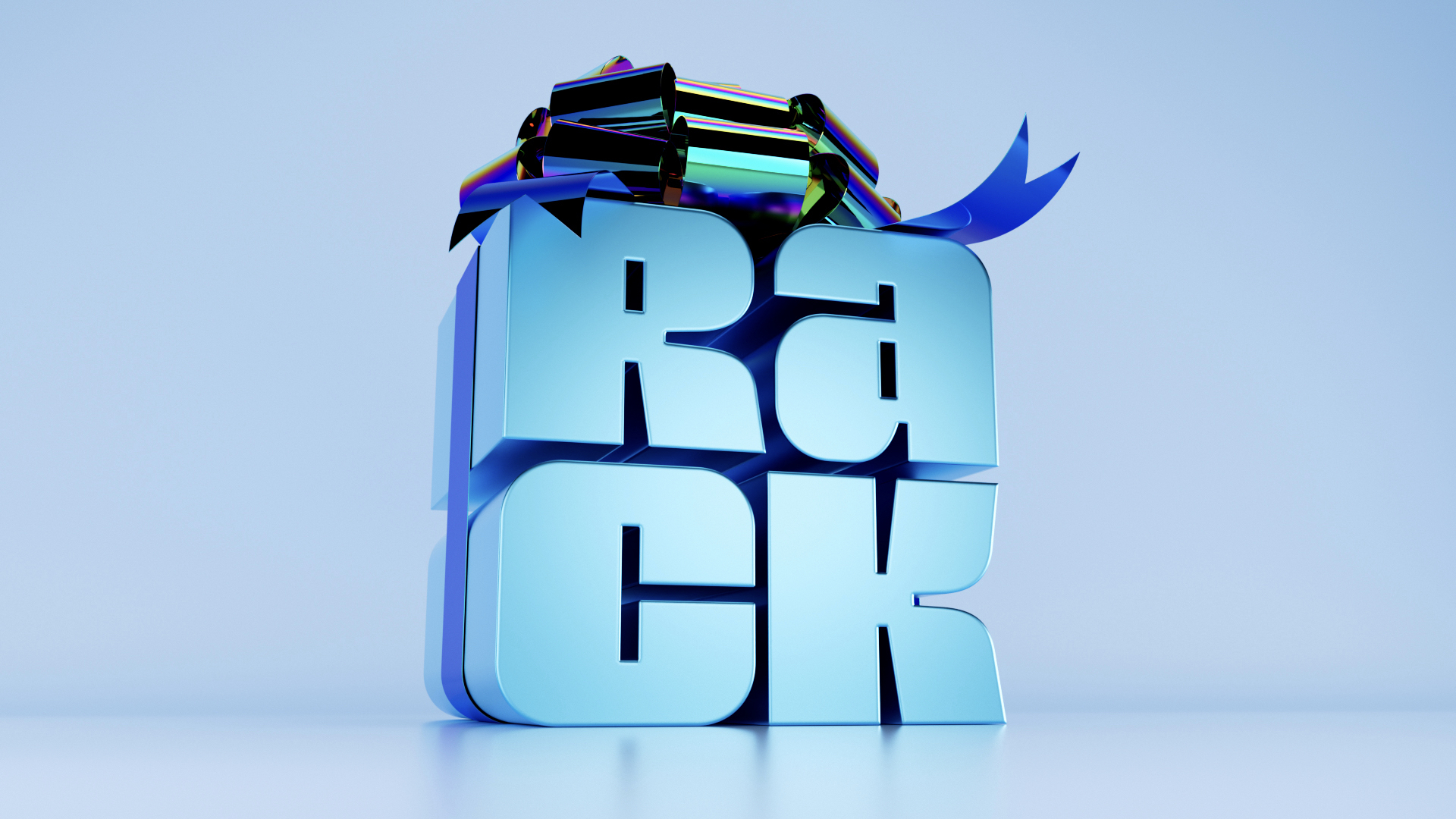
As part of this new system, Nordstrom Rack is rolling out a new logo, inspired by the Rack logo used in 1970s and 80s and modernized for today. The new logo was designed on a modular grid to be responsive for all sizes and platforms, which helps the brand remain consistent across digital and physical experiences. Additionally, the new logo more closely aligns the Nordstrom and Nordstrom Rack brands, further illustrating the company’s interconnected business model. The new identity also includes a custom typeface as seen in the logo to further embody the spirit of the brand and allow for differentiation.
The master brand color was updated and expanded, from a singular mid tone color to a more vibrant and exciting palette. The brand's blue evolved to a set of multiple signature blues creating more flexibility and variety, and secondary and tertiary color palettes signal seasonal changes and amplify sales and promotions. A distinctive voice was developed to fit a spectrum of messaging—from sharing the brand’s bold personality, to succinctly communicating practical information such as pricing and sales.
“As we began work with Nordstrom Rack it immediately became clear that their customers are bold, confident and savvy and that we had an opportunity to embody that spirit and the brand’s unique proposition through its visual identity and brand experience,” said Lisa Smith, JKR Executive Creative Director. “We created this identity system to be distinctive to Rack, responsive across all touchpoints and ultimately to connect with the Rack customer, wherever they interact with the brand.”
Starting this spring, customers will see the new logo and refreshed identity in marketing campaigns and on the company’s digital channels including NordstromRack.com, the Nordstrom Rack app, social media and email communications as well as in person with exterior and interior signage of new and remodeled stores.